
Personal Loans Joint App Redesign
Team:
Product Designer
Product Manager
Product Marketing Manager
User Researcher
3 Software Engineers
2 QA Engineers
Product Analytics
My Role: UX, UI, visual, product design & user testing research
The Problem: Majority of LendingClub customers don’t apply for or consider a joint application because of lack of awareness and education about this feature in our end to end experience even though it can benefit them in the end.
The Objective: The overall goal of this project is to re-design the loan type screen to help educate customers about the joint program and how it is beneficial to people who fit the criteria. While educating more about the two types of application, we also want users to feel confident and good about the choices they make. We learned from v.1 that we many users still want to do individual app so we wanted to make sure we focus on that population as well.
Project Context: The product manager and I partnered together to create a new program to grow the joint application business. We developed a roadmap together and launched a v.1 experiment. We worked on this project in Q4 of 2019 to Q1/Q2 of 2020.
Metrics:
Shift 2% of existing individual issued loans to joint applications from 15% to 17% which is ~$7mm quarterly incremental issuance
Increase time on page
So users can digest information and consider the option
Reduce questions people have about the joint application process
Help customers feel confident in whatever choice they make
Current Experience

User Population 1
Majority of LC customers who have a past joint extension of credit don't apply for a joint application with LC.
User problem: “I don’t consider applying for a joint application with LC, because I don’t see the value of joint app and I don’t quite understand how the process works.”
~55% of customers with previous joint trade-line didn't get a joint loan with us even though they could be a good fit for this program
User Population 2
Majority of LC customers don't consider applying for a joint application
User problems:
“I don’t have enough information (logistics, process, the value) to make an informed decision about my loan app.”
“I am not aware of this type of application.”
“I don’t want to apply for a joint application.”
~85% of individual issued LC users don’t consider joint app today (from our user research)
Without enough information , users feel general uncertainty & opt-out of joint based on a default mentality. We’re filtering out high intention people by not providing tools to provide language to their questions and act with confidence.
At least 17% of these users would like a joint app and / or are a good fit for a joint app
First Initial Concepts
Concept 1: Re-design & Add-On
By giving users an option to add a co-applicant up until their offer is locked, then it will help them make a thoughtful and timely decision about whether joint app is right for them and increase joint app opt-in.

Concept 2: Interactive Criteria
By helping customers understand that they are a good fit for a joint app, then we will increase joint app opt-in.

Concept 3: Re-design + Re-order
By moving the joint app decision later in PI1, it better aligns with customers expectation of the application and decision making model.

I presented the concepts to the team and we decided to do some user testing to see how people would react.
Moderated Concept Testing
I interviewed 10 people in the U.S (general population of getting/have/had a personal loan to pay off debt) to understand their overall expectations of a joint app, what people thought the process should look like, where in the flow it makes sense to ask people if they want to do joint app, how they interpreted the content, benefits, and terminology on the opt-in page.
Concept 1: interactive Criteria
Concept 2: Re-design + Re-order
General Insights:
People definitely considered the joint option when we present value props and extra context, even if they didn’t choose joint
The value props are strong - everyone felt like the benefits were good overall but majority of users were curious to see a more personalized savings data
Josh resonated with the savings value prop now because he felt like he was at a good place financial but if he was looking at this 10 years ago or so he would resonate with the approvals value prop
The disclaimers helped validate the value props even though they were general data points
People wanted to compare their offers (or how much they would save) between their individual loan and joint loan
People were concerned about who to ask to
“you need to really trust this person” whether they are family member, friend, spouse
Not all couples share their finances
“my debt, my finances, my responsibility”
The people who were unsure about which option to pick wanted to pick individual first, look at their offer, and then add someone if they wanted to
The people who are a good fit for joint (4 people) had no hesitation making a decision - these were people who had someone in mind and shared all/most of their finances
Concept 1’s joint opt-in page felt more compelling because it felt like it was really selling the product
Concept 2’s flow met more people’s expectation
Recommendations:
For concept 1:
If we were to continue exploring this concept in the future of creating a “dynamic funnel” we should think of adding more diverse checkmarks instead of just all joint
For concept 2:
We should create a softer intro of DOB page or maybe start with “name” for a softer experience
Apply similar visual treatments on the 1st joint page to 2nd page - make this product more appealing (but have same look and feel of PI1 1QAAT)
General:
Use phrases or words like “apply together”, “do you want to apply with someone” rather than “co-applicant” / “co-borrower”
Show FAQ drawers on the page instead of a “learn more” link
Future:
Let users add a co-applicant anytime in the application
Show how much they are saving by doing a joint app vs. individual app
Show comparison between individual and joint offers
Final Joint App Variants
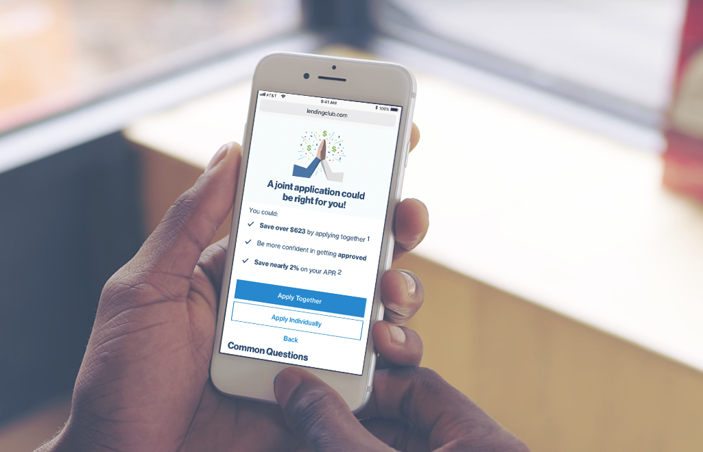
Variant A: Re-design joint page
We tested the re-design of the joint page by changing the terminology, adding the benefits, and an FAQ section to give people the context they need to make an informed decision. We tested the re-design of the joint page separately from re-ordering to understand what changes impacted the test results.

Variant B: Re-order + Re-design
We tested re-ordering and re-designing the joint opt-in page together. From the concept testing research, this flow met more of people’s expectations and mental model of inputting their personal info first and then being asked if they want to do joint. We re-designed the page same as variant A by changing the terminology, adding the benefits of doing joint app and also an FAQ section to give people the context they need to make an informed decision.
Variant C: Interactive Criteria
We wanted to further explore this interactive criteria concept where we try gather some data on our users to personalize their funnel experience. For this concept, we wanted to see if users were a good fit for a joint app by letting them select the checkmarks that is relevant to them. If they had a joint extension of credit then we surfaced this celebratory joint opt-in page. From the concept testing, users resonated with the celebratory joint opt-in page.
Variant D: Interactive Criteria + Re-order
We wanted to test the combination of re-ordering and the interactive criteria together to see if users were more likely to fill out the survey after they input their personal information (meeting user’s expectations of inputing PI in the beginning).
V.1 Learnings

The reordering of variant B and D, which having the “Name” page as the first page caused a significant drop-off. The hypothesis for this is that asking for name is a pretty serious starting point and a bit too scary for the users who are still in the exploration stage.
Variant A’s copy/design did not work very well. Comparing to the Control loan type page, variant A has a significant and large-sized drop-off. There are two hypotheses for this: 1. Either we included some sensitive information that caused drop-off or we have missed some important information that could improve conversion 2. There are too many benefits mentioned. The majority of users would still like to go with individual, and the benefits mentioned has discouraged them, made them feel that they cannot take the advantage from it and this is not the right product to them.
Both variant A and variant B have discouraged individual applicants.
The absolute individual selection volume has decreased
The individual selected user’s conversion (from app type to pi1 submit has decreased)
Both variant A and B have not encouraged more individual-oriented users to convert to a joint user, but they have encouraged joint-oriented users to be more likely to move forward (from app type to pi2 submit).
By introducing a new screen that asks about your history of co-app experience, we experienced a bit of drop (~3%)
V.2 Explorations
Concept 1: Progressive Disclosure
By showing users an equal layout of the individual and joint decision and only show additional benefits when chosen, then they won’t be overwhelmed with benefits that don’t apply to them and feel confident in the choice they make.

Concept 2: Interactive Criteria 2.0
By customizing the individual flow to focus on the individual application more, then more users would move forward with that option and we would see less drop-off on that screen since it best fits their situation.
Unfortunately we did not get to launch these versions for a v.2 experiment due to changing business priorities during the COVID situation.